img_bpmind_top
Track your health
BP Mind
High blood pressure management app
BP Mind is an app that tracks and visualizes the connection between stress and blood pressure, helping users become more aware of their daily health patterns and supporting stress management for better well-being.
1. Project background and purpose
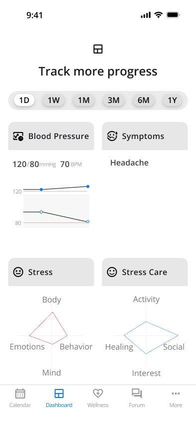
The BP Mind app aims to engage with health by understanding the relationship between stress and blood pressure, enhancing motivation for blood pressure management, and actively supporting improvements in overall health. While it is widely known that stress affects blood pressure, accurately understanding and managing this impact remains challenging. BP Mind focuses on the fluctuations in blood pressure influenced by stress. By recording and visualizing blood pressure, stress levels, stress management practices, and symptoms, the app facilitates understanding of changes and patterns, helping to raise awareness of effective treatment and health management.
Blood pressure management
Blood Pressure Management
Monitor overall health by recording blood pressure and analyzing patterns.
Symptom tracking
Symptom Tracking
Identify symptom patterns and their links to blood pressure and stress to enable early detection and effective management.
Blood pressure management
Stress identification
Understand stress patterns and triggers by evaluating physical, mental, behavioral, and emotional factors to enhance coping strategies.
Stress care implementation
Stress Care Implementation
Discover personalized stress care solutions by tracking activities, interests, social interactions, and relaxation techniques.
2.  Research
Focusing on the relationship between high blood pressure and stress, I explored ways to better support personal health management. To design from the user's perspective, I conducted research and analysis.
2-1. Competitors
Differentiate BP Mind from your competitors by understanding their strengths and weaknesses.
Features
I researched seven apps in the health category on April 30, 2023. While some apps offer memo functions, none specifically addresses stress management.
Design and Content
On April 30, 2023, I researched 17 apps. The research focused on design trends and content based on search results from the following keywords: Google search for "popular health app" and the Apple App Store categories "Health & Fitness" and "Medical," particularly apps related to "Stress."
Findings
  • Vector graphics has been used more frequently than photographs
  • Blue is commonly used
  • Compatibility with other Apps is offered
2-2. Research interview
User interviews were conducted to learn about users' health awareness and their needs for managing stress.
Since more than half of men and women over 50 are reported to develop high blood pressure, I chose people in their 50s as the main target audience. By inviting them to share personal stories based on their own experiences, I aimed to gather their honest thoughts and opinions.
Conducted betwen April 22, 2023 and May 5, 2023
Participants
Participants
13 individuals
6 men and 7 women
60s
50s
● ● ●
● ● ●
40s
● ●
30s
● ●
Interview styles
Interview styles
Interview styles: In person, via video, and over the phone.
Research method
Research method
I prepared 10 questions divided into three categories: health concerns, stress, and stress care apps.
Insights from the results
Targeting individuals in the 50s
All participants in the 50s had a strong interest in health and were dealing with lifestyle diseases (e.g., hypertension).
Q. Do you have any concerns about your health?
Presenting the specific features and benefits of the App
While most showed interest in health apps that include stress care, they may not get engaged without specific feature proposals.
Q. Have you experienced any symptoms of stress, such as pressure, fatigue, depression, lack of energy, difficulty concentrating, trouble sleeping, or changes in appetite?
Provide visuals of blood pressure changes and care methods
All participants believed that stress affects health, and they emphasized improving their lifestyles. 85% had experienced stress in their work or private life and were independently practicing stress management methods. 92% were interested in preventive medicine, indicating high expectations for the app in maintaining future health.
Q. Could you please provide three features you would be interested in using from the following six categories:
2-3. UI design tailored to address age-related vision issues
In consideration of the target users' age-related eye conditions (such as presbyopia and cataracts), I  explored how they perceive colors in the UI design.
Problems
  • Decline of color vision or the ability to distinguish colors
  • Vision impairment
  • Decline in cognitive function
Findings
  • Use high-color contrast
  • Reader-friendly fonts with appropriate sizes
  • Avoid troublesome actions and tasks
3.  Ideation
Using insights from the research interviews and reflecting on the traits and behavioral patterns of the target audience in their 50s, I developed personas to uncover user-centric needs.
3-1. Personas
The ideal user is a hypertensive individual in their 50s who experiences stress. To address common eye conditions affecting middle-aged and older adults, like cataracts and glaucoma, I plan to enhance accessibility by adding color to blood pressure readings. To keep users engaged and interested, I will provide regularly updated content, including a user community and expert health information.
Persona_John
persona_andrew
persona_suzy
3-2. Empathy map
Set BP Mind apart from the competitors by identifying their strengths and weaknesses.
empathy map
3-3. Moodboards
Understanding the actions and emotions that arise when using a product can help identify challenges and areas for improvement, enhance the user experience, and provide effective communication and support.
Moodboard_img
3-5. User Journey
Understanding the actions and emotions that arise when using a product can help identify challenges and areas for improvement, enhance the user experience, and provide effective communication and support.
bpmind_journey
Findings
  • Provide "sign-up options": Email sign-up and social media sign-up
  • Sync data from blood pressure monitor to phone
  • Create charts to help visualize changes
3-6. User tasks • Information architecture • User flows
Understanding the user flow provides insight into the steps users take, revealing needs and opportunities to refine navigation.
Insights and goals
  • Organize the blood pressure management page without overcrowding, using an effective UI to guide users to achieve their goals smoothly.
  • Set search functionality, filter, and sort to find information quickly.
  • Functional and appealing buttons and icons improve user experience by enhancing ease of use and clarity.
3-7. Style guide
To maintain brand consistency, coherence, and design quality.
Colors
Primary color, Blue
I chose blue as the primary color for the BP Mind logo. Blue is commonly used in health-related contexts, symbolizing trust and reassurance while promoting a calming effect. It encourages stress reduction and highlights the importance of blood pressure management and mental care. I selected a high-contrast blue as the primary color and used the Material Theme Builder to choose secondary, accent, and other colors. The gradient used for the background color was created using Figma.
color_bpmind

Typography
Roboto
Based on the search results from the Readable font app, which included Roboto, and the fact that Roboto is utilized in Google's typography, I used Google's text style as a foundation while making adjustments to better suit the content of BP Mind. For instance, while Google's body large size is set at 16px, I increased it to 17px to accommodate the eye conditions of BP Mind's targeted middle-aged users.
bpmind_typography

Logo
The BP Mind logo is designed to reflect the connection between blood pressure and 'Mind,' with the 'M' in 'Mind' resembling a blood pressure graph. This represents the key themes of BP Mind: blood pressure management and mental care.
bomind_logo_2bomind_logo_3bpmind_logo_2

The text of the BP Mind logo was designed to reflect the movement of blood pressure, experimenting with various Oblique fonts. Finally, adjustments were made to the spacing to balance with the design of the "M."

Style guide
4. Wireframing
Wireframing involves organizing information, visualizing the design structure and layout, and reviewing user flow and navigation to assess overall usability.
4-1. Wireframing draft
The wireframe is structured by six categories: onboarding, BP (blood pressure management) data (dashboard), wellness, forums, and more. The wellness section provides expert information, while the forum allows users to share information.
Onboarding
Overview, account creation, and log in
BP
Entry, edit and records of blood pressure, symptoms, stress and stress care
Data
Charts of blood pressure, symptoms, stress and stress care
Wellness
Expert Articles
Forum
Community among BP Mind users
More
Profile, favorites, settings, about, FAQs, contact us, and terms of use
4-2. Process
I developed solutions to design an appropriate UI that organizes information, clarifies priorities, and guides users to operate correctly.
Calendar design
I first began designing the calendar and examining various ways to present information effectively.
1. Monthly view
Objectives:
  • Show blood pressure values to enable better monitoring and understanding of blood pressure fluctuations.
  • Make stress and stress management status visible to understand the relationship between stress and high blood pressure.
Issues:
  • Since users may measure blood pressure multiple times a day, deciding which value to display became a challenge.
  • Used blue for stress and light blue for stress care, but they stood out more than blood pressure monitoring, shifting the focus away from the primary purpose.
bp_monthly
2. Weekly view
Objectives:
  • Allow quick access to data and easy input.
  • Include weather information, as atmospheric pressure changes can affect the autonomic nervous system and blood pressure.
Issues:
  • Instead of focusing on daily data, showing overall blood pressure trends would provide a clearer understanding of the user's condition.
bp_weekly
3. Digest view and detail view
Objectives:
  • Highlighting high blood pressure days improves awareness.
  • Display all information at once to reduce user tasks.
Issues:
  • Too much information makes it hard to track blood pressure changes.
  • Reducing the calendar display and adding blood pressure information makes it easier to access key data, improving usability.
digest viewdetail view
Idea
Solution
  • When displayed monthly, the space for blood pressure records is significantly reduced. Since blood pressure records take priority over the calendar, I changed the calendar to display every three weeks so that blood pressure records can be more visible.
  • Blood pressure records are displayed below the dates in blue (normal) and red (high blood pressure), making changes easily recognizable at a glance.
  • The font size for dates were increased to 20px to improve readability.
  • If the calendar numbers are too dark, blood pressure records won't stand out, making it hard to see priorities. Using subtle black improves navigation, and lighter tints for weekends differentiate them from weekdays.
BP_calendar
Data
"Data" is designed to provide a clear view of blood pressure trends, symptoms, stress, and stress management records at a glance. To make blood pressure changes easier to understand, the graph design and information hierarchy were carefully structured.
Graph
Objectives:
  • Design the layout to make blood pressure values, symptoms, stress, and stress management records easy to grasp. Quick access to records helps users track changes in their condition and stay motivated to enter data.
  • Selecting the data display period allows for flexible analysis based on the user's needs.
Issues:
  • Instead of enlarging the selected item, placing the most important blood pressure graph at the center is better to enhance visibility.
  • While a line graph shows numerical changes, it does not intuitively convey the significance of abnormal values or sudden fluctuations.
Dashboard  TodayDashboard 6M ExpandDashboard 6M Expand_bp
Idea
Solution
  • Users can quickly focus on key trends and changes by placing the most important blood pressure graph at the center.
  • A color gradient is used so that users can intuitively understand blood pressure trends and abnormalities, making it easier for them to notice changes quickly.
  • Sliding to switch between previous and next dates or periods allows for smooth data viewing.
data
4-3. High fidelity wireframing
5.  Prototype
Interactive elements are implemented based on the mockups to facilitate user interaction.
Onboarding
1. Overview
2. Create account with email
3. Continue with google
4. Welcome back
5. Forgot password
6. Reset password
7. Forgot password
BP and Data
1. Entry BP data
2. View BP's details
3. Edit BP data
4. Delete BP data
5. View data: Day: today
6. View data: Week: previous day
7. View data: Year
Wellness
1. Search by keywords
2. Select articles
3. Add comment
4. Take photos
5. Post  comment
Forum
1.  Search by keywords
2. Filtering
3. Select articles
4. Add comment
5. Add photos
6. Post comment
7. Create a post
8. Take photos
9. Post article
More
1. Profile
2. Favorites
3. Settings
4. About
5. FAQs
6. Contact us
7. Terms of use